
You can tell a generated carousel from across the room. Plastic skin, impossible kitchens, headlines that melt into the background, and a different art style on every slide. The model is not the whole problem. The brief is.
If you ask for “a stunning social media post about productivity,” you will get stock-photo sludge. If you ask for a specific scene, a locked palette, and a headline that is specified as text — not hoped for — the deck holds together.
Brief a scene, not a poster
Describe what is in front of the camera: who, where, time of day, what they are holding. Leave out “viral,” “professional,” and “high quality.” Those words do not constrain anything.
Good: “Over-the-shoulder at a standing desk, late afternoon window light, phone in hand, no readable screen.” Bad: “Eye-catching Instagram carousel about our SaaS, ultra realistic, 8k.”
Keep people unposed when you include them. Candid beats the handshake-in-a-glass-office look. Never ask for logos, watermarks, or infographics in the image — those are how models invent letterforms you cannot edit.
Lock the brand before you generate ten slides
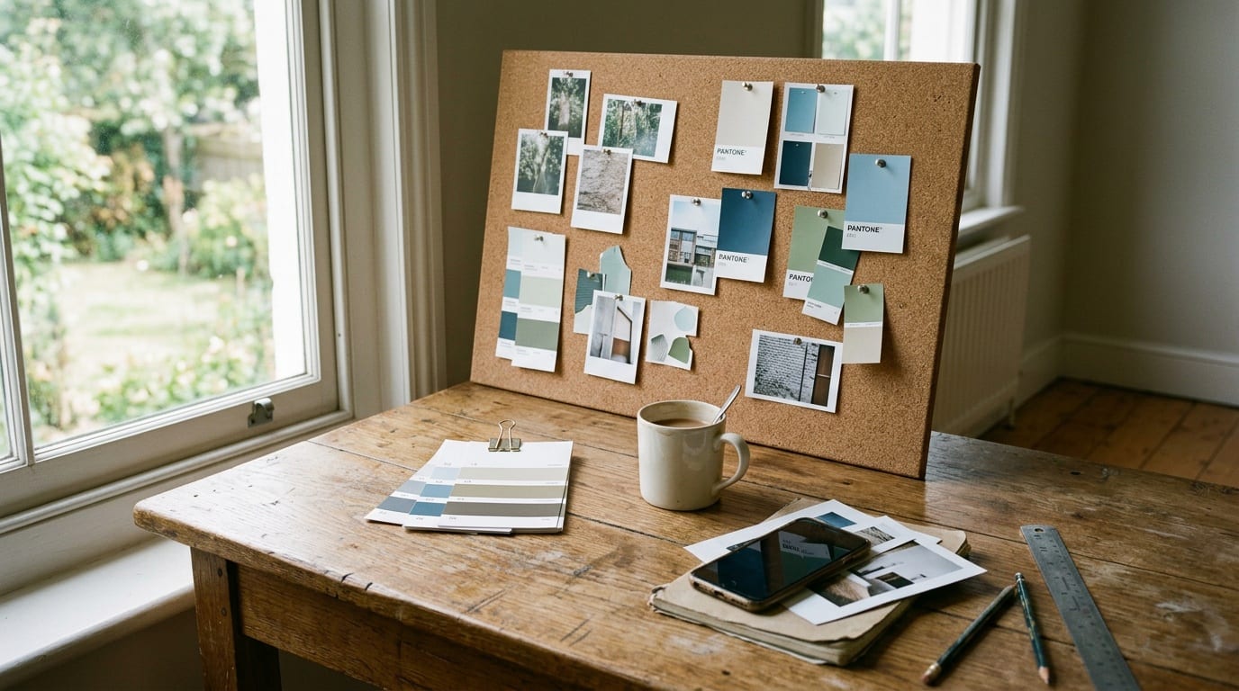
A brand kit is not decoration. It is how slide four still belongs with slide one.
You need three references, used on purpose:
- Logo — for placement, not for the model to redraw
- Style — one image that defines light, palette, and texture
- Product — only when the product should actually appear
If the style reference is a neon 3D render and the product shot is a matte bottle on marble, the model will split the difference and look drunk. Pick one world.
Regenerate a single slide when the scene is right and the headline is wrong. Regenerating the whole deck because slide six drifted is how you lose an afternoon.

Headlines are copy, not part of the picture prompt
On-image type should come from your slide copy, specified exactly, not from whatever letters the image model invents. If you can see the headline in the JPEG as random glyphs, the slide is already broken for video and for anyone who pinches to zoom.
Keep headlines short. High contrast against the area they sit on. One line beats three. The image does the atmosphere; the type does the teaching.
Consistency beats novelty
A campaign should feel like one photographer shot the week, not like six unrelated Midjourney tabs. Repeat the setting. Repeat the palette. Change the subject only when the argument needs it.
That is also why a product like SlidePress generates the deck as a set — same brand refs, same aspect, then you fix one frame at a time. Variety is a caption problem. The pictures should look related.
Start free at slidepress.co.